Web UI
The Waveshift Web UI is a browser-based control panel for operating
your Waveshift deployment. It runs on the orchestrator host and is
served over HTTPS at the URL you set during deployment (typically
console.waveshift.<your-domain>).
This section is a tour of every page in the UI — click any thumbnail below to jump straight in.
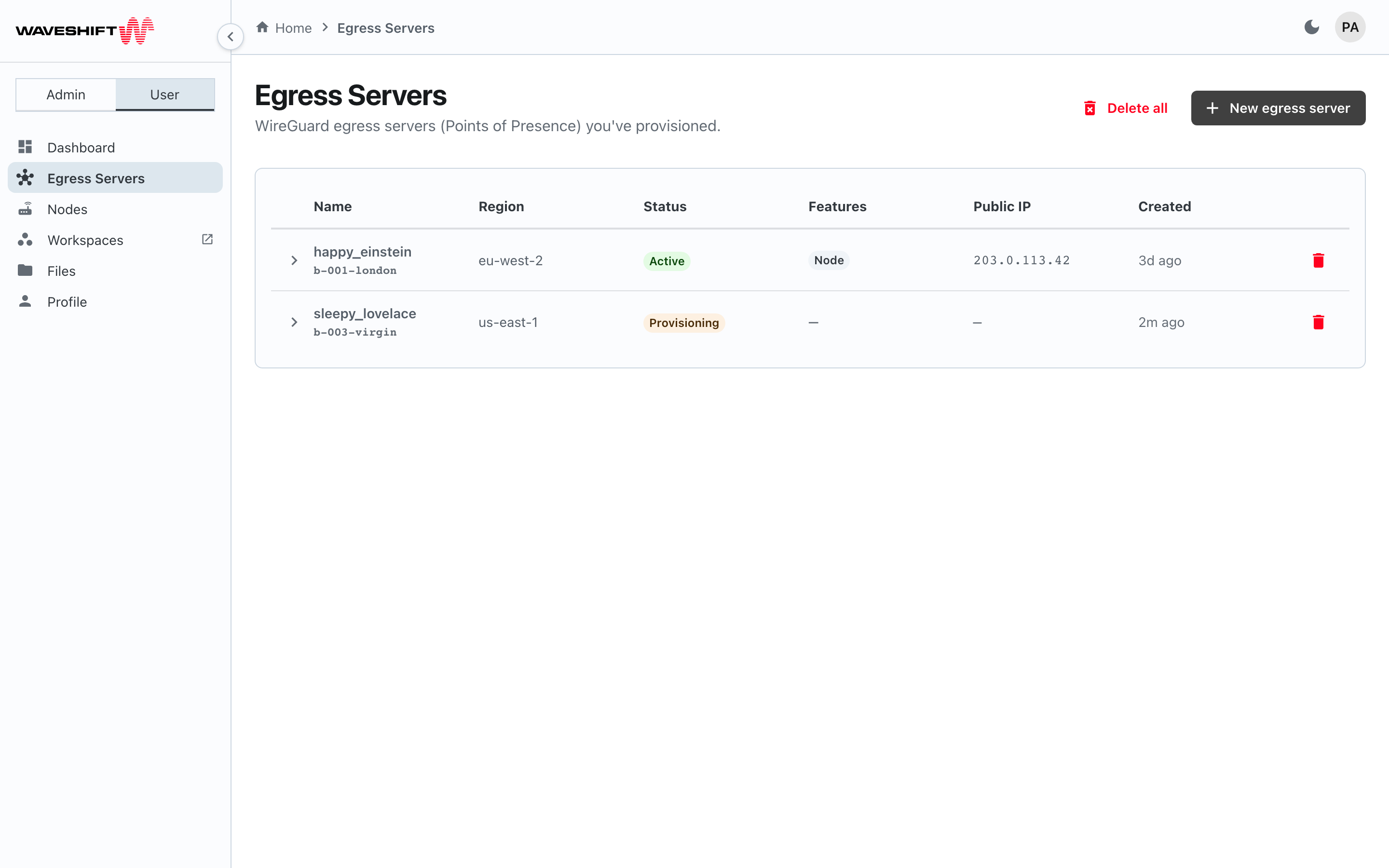
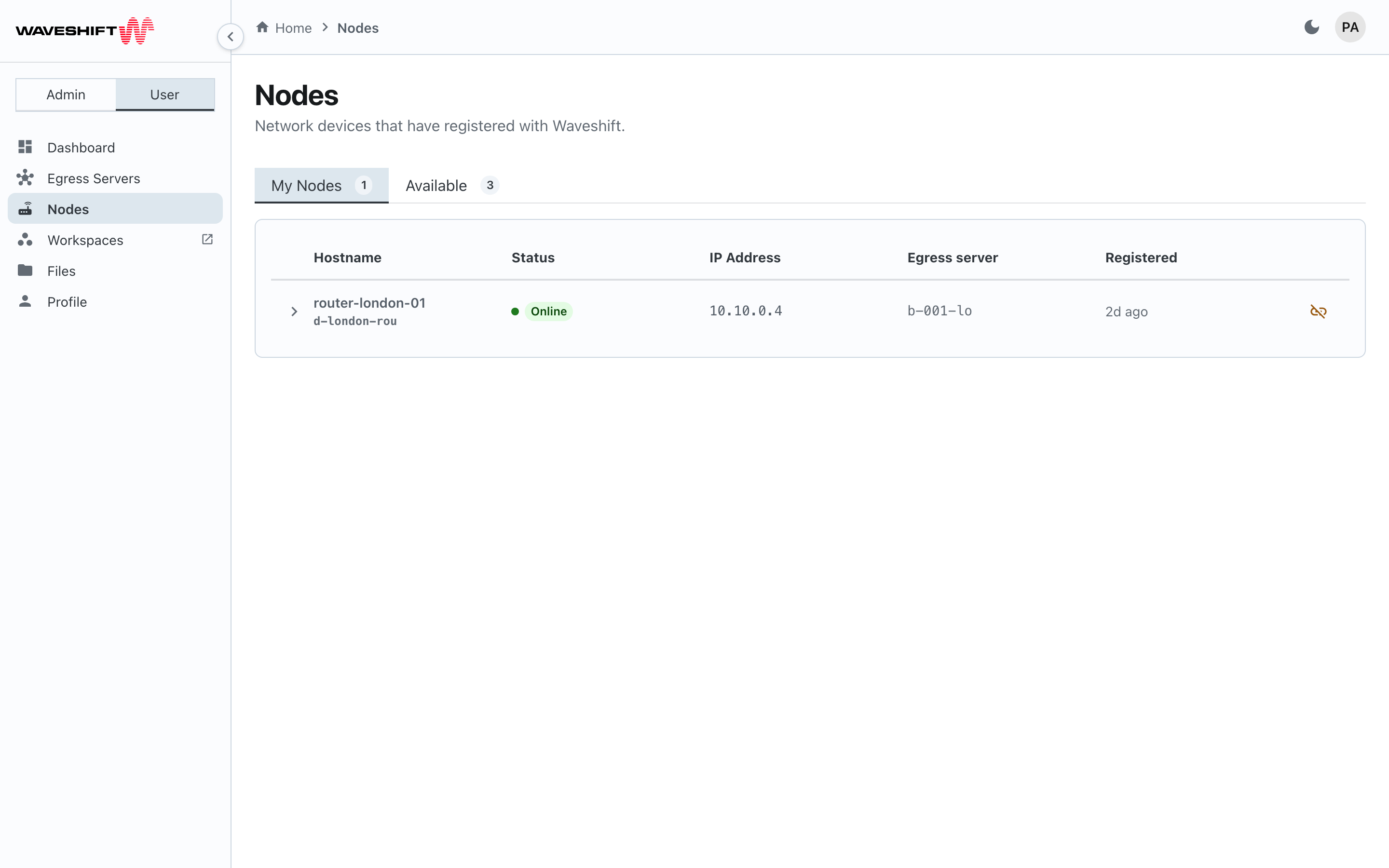
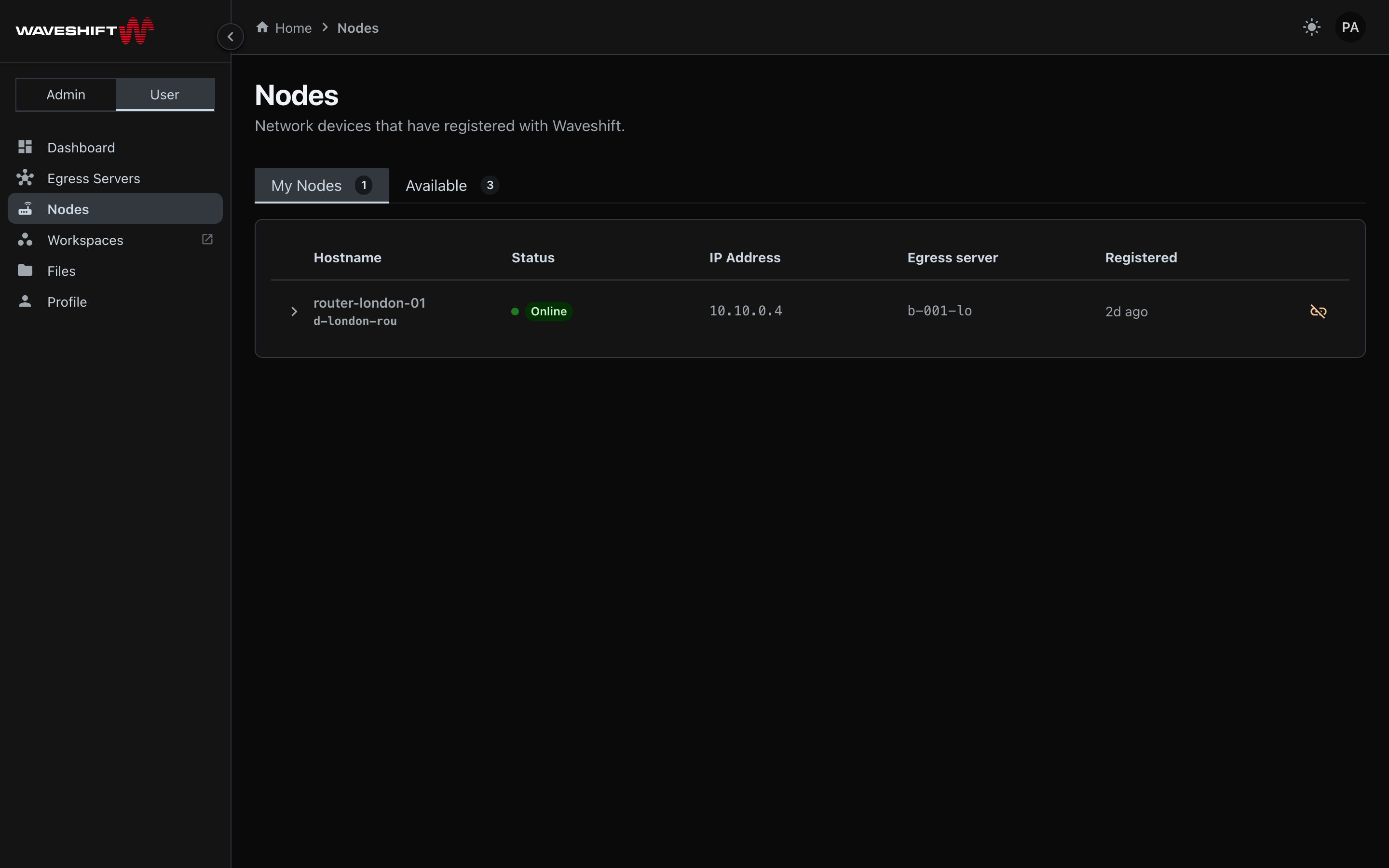
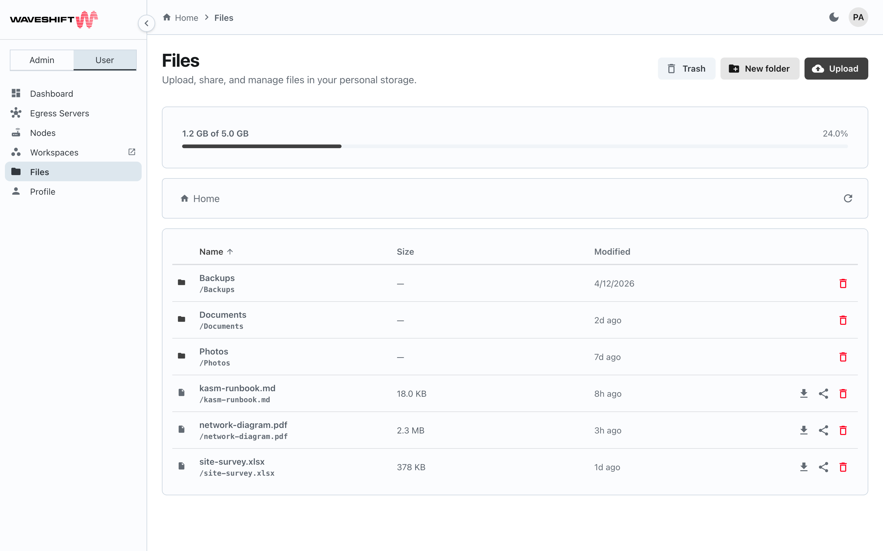
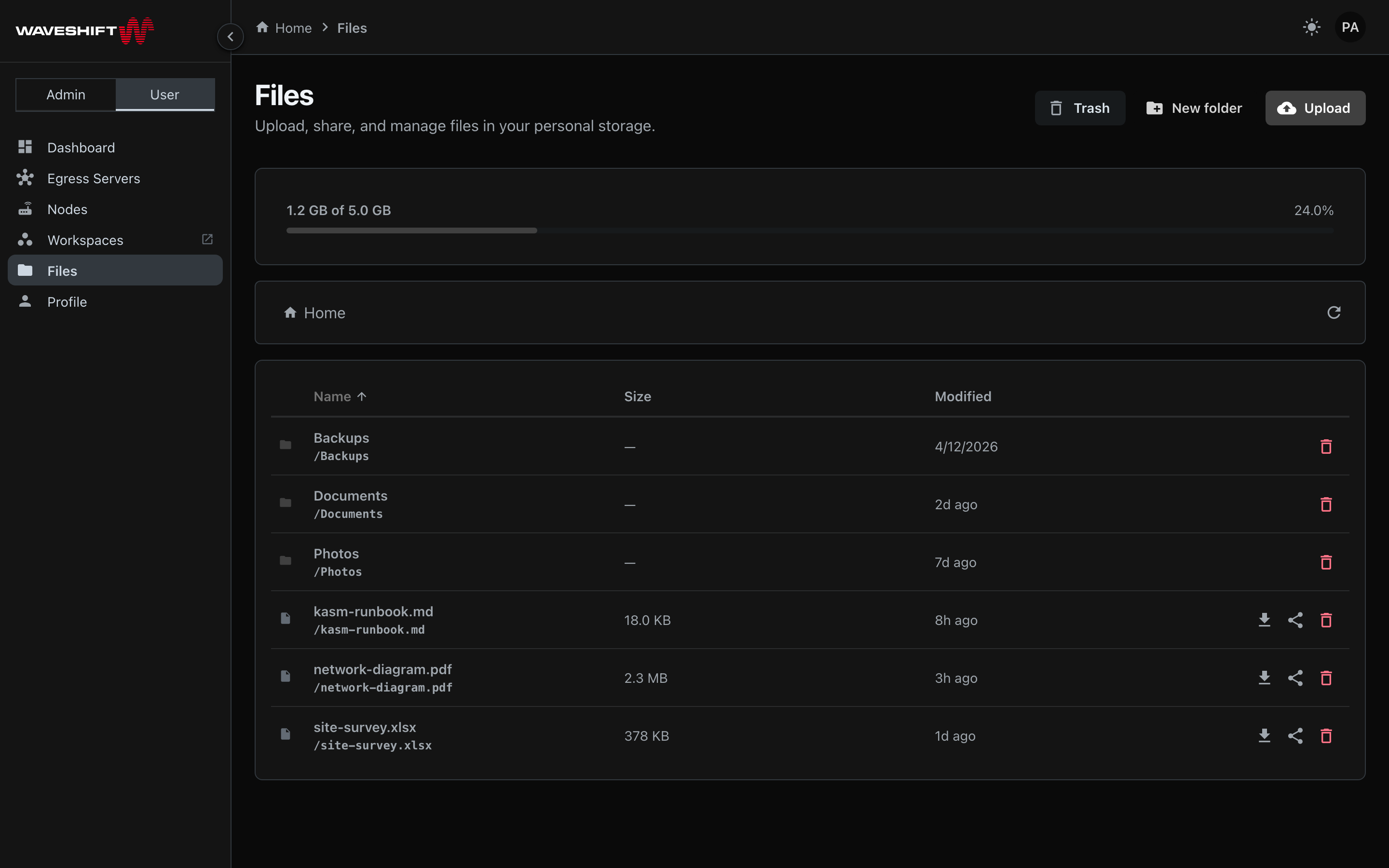
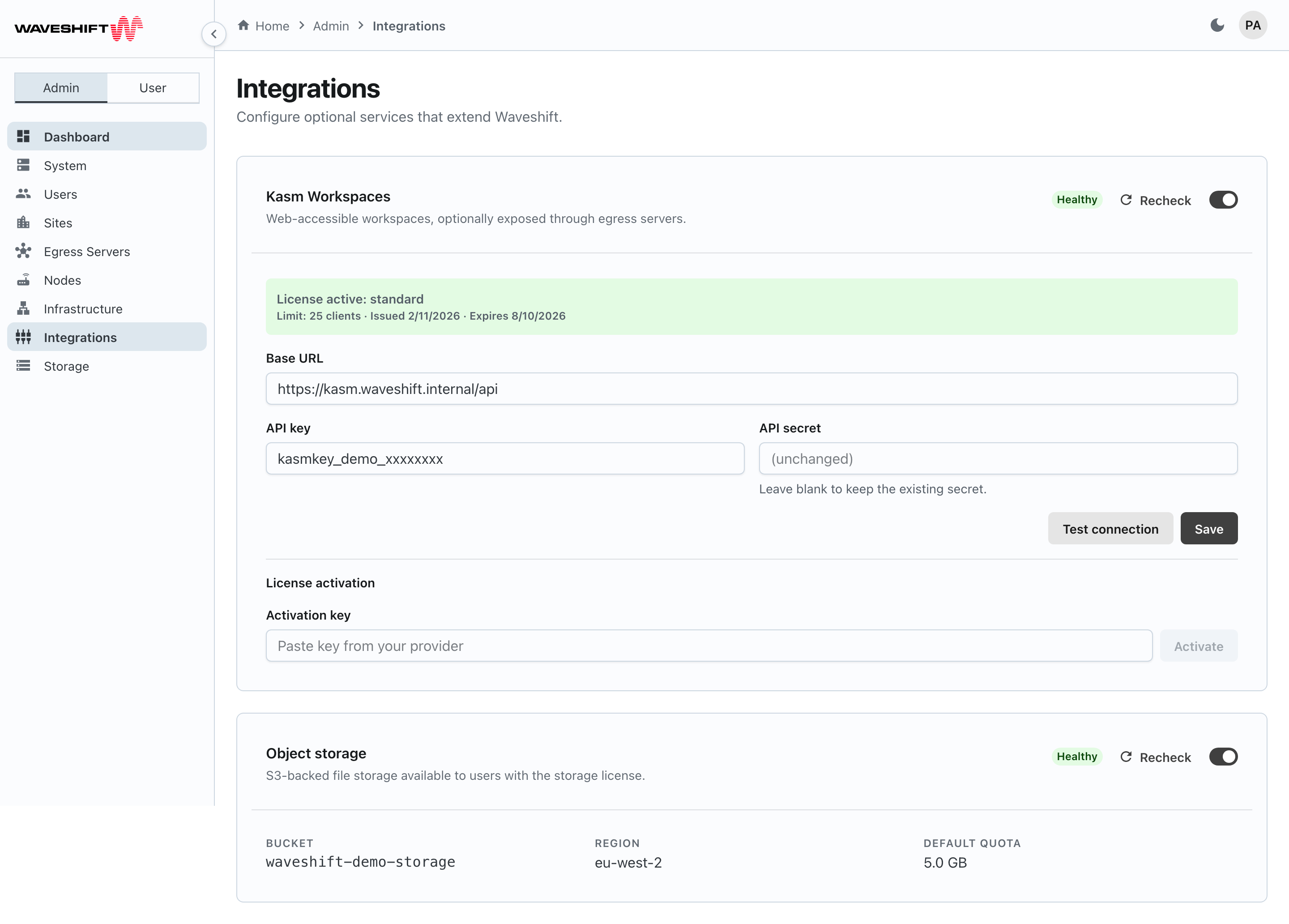
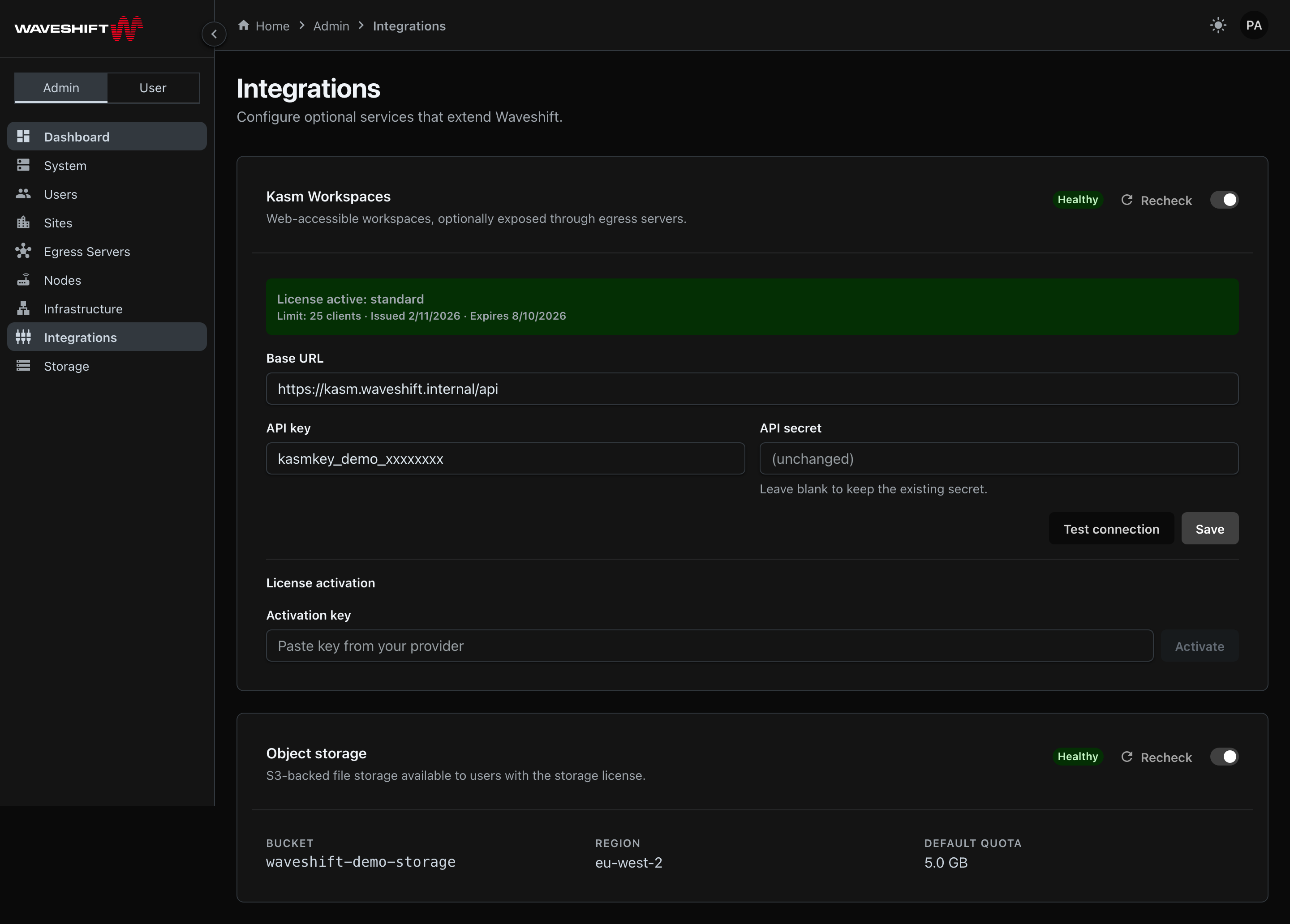
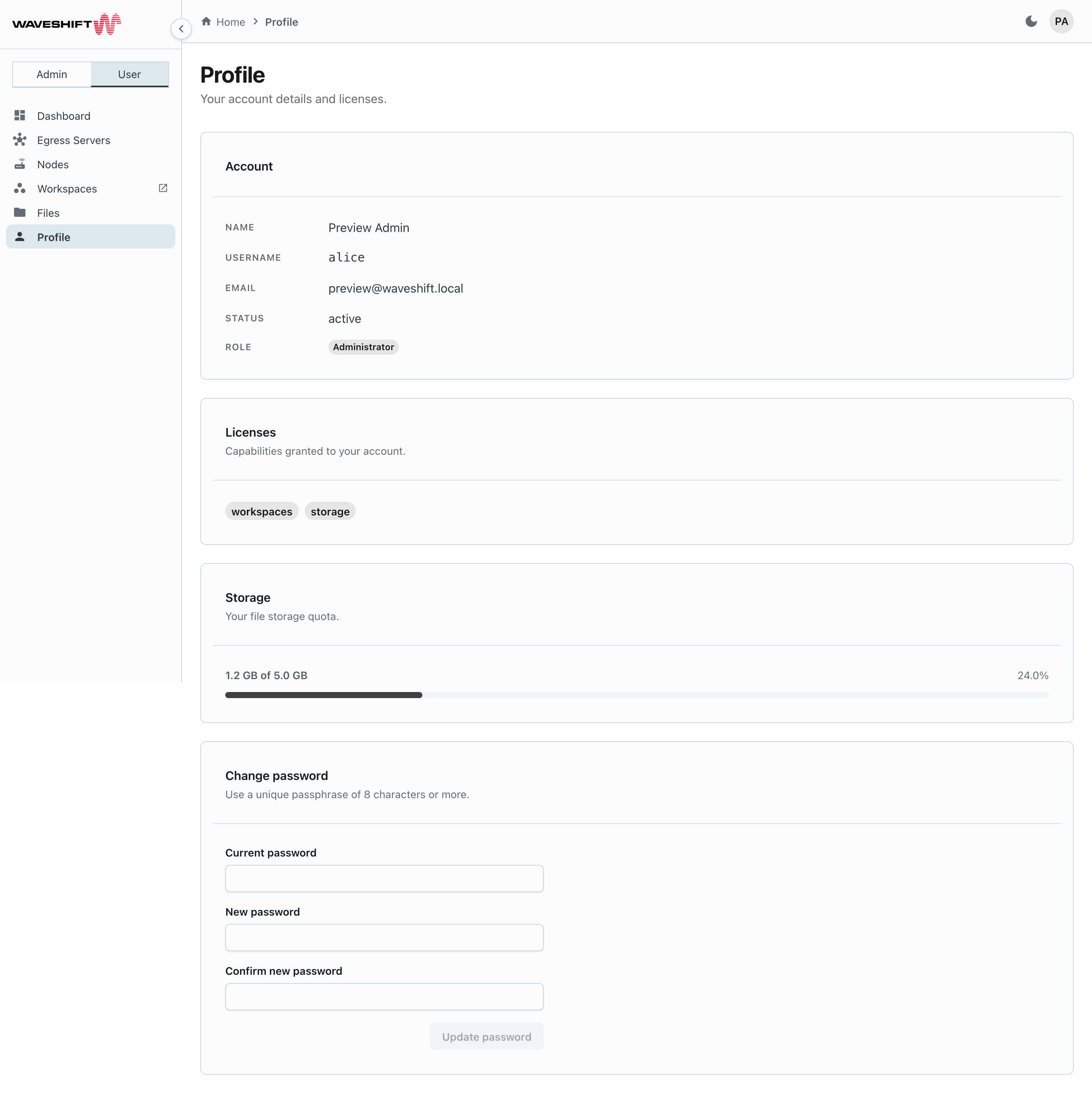
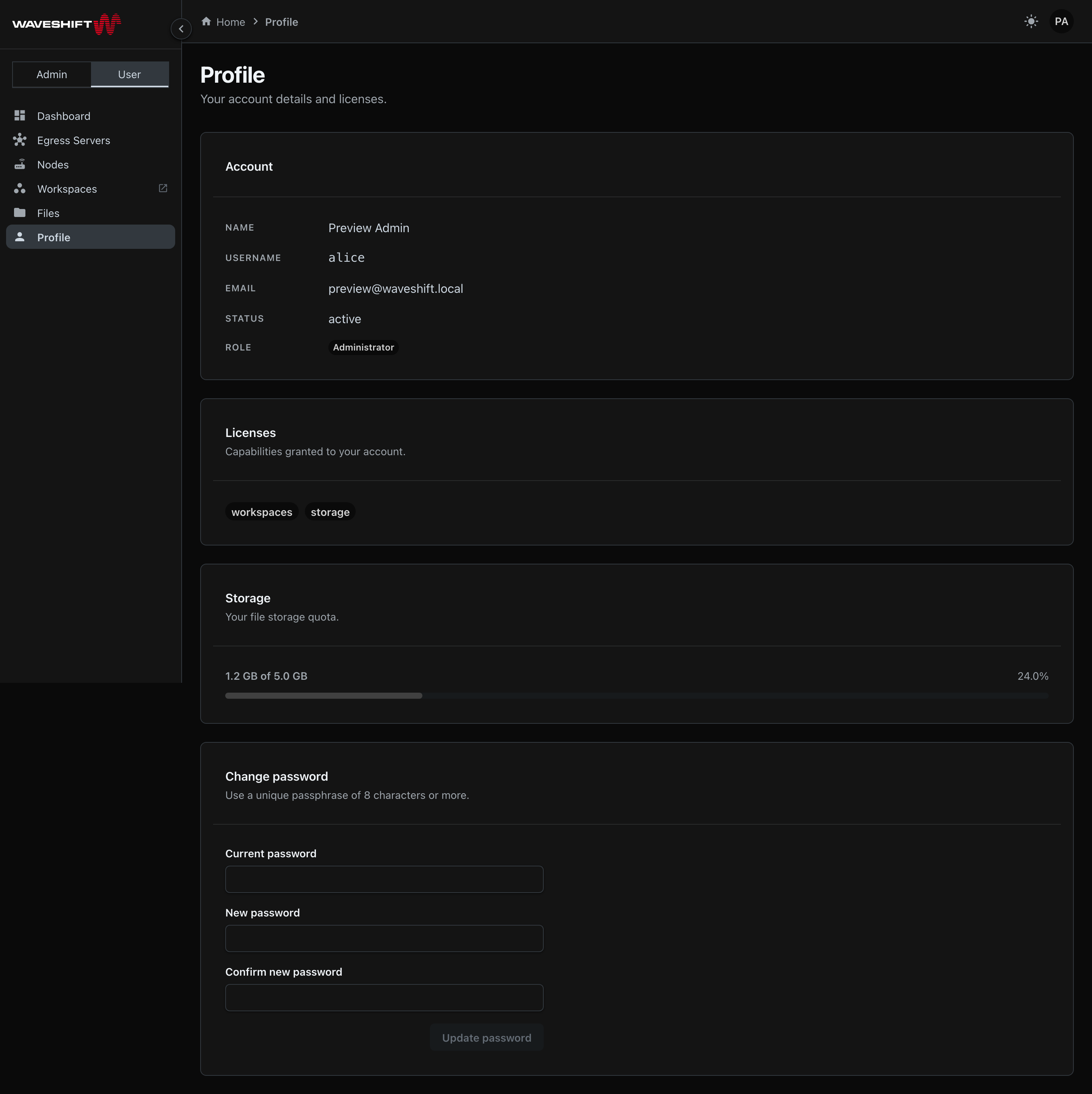
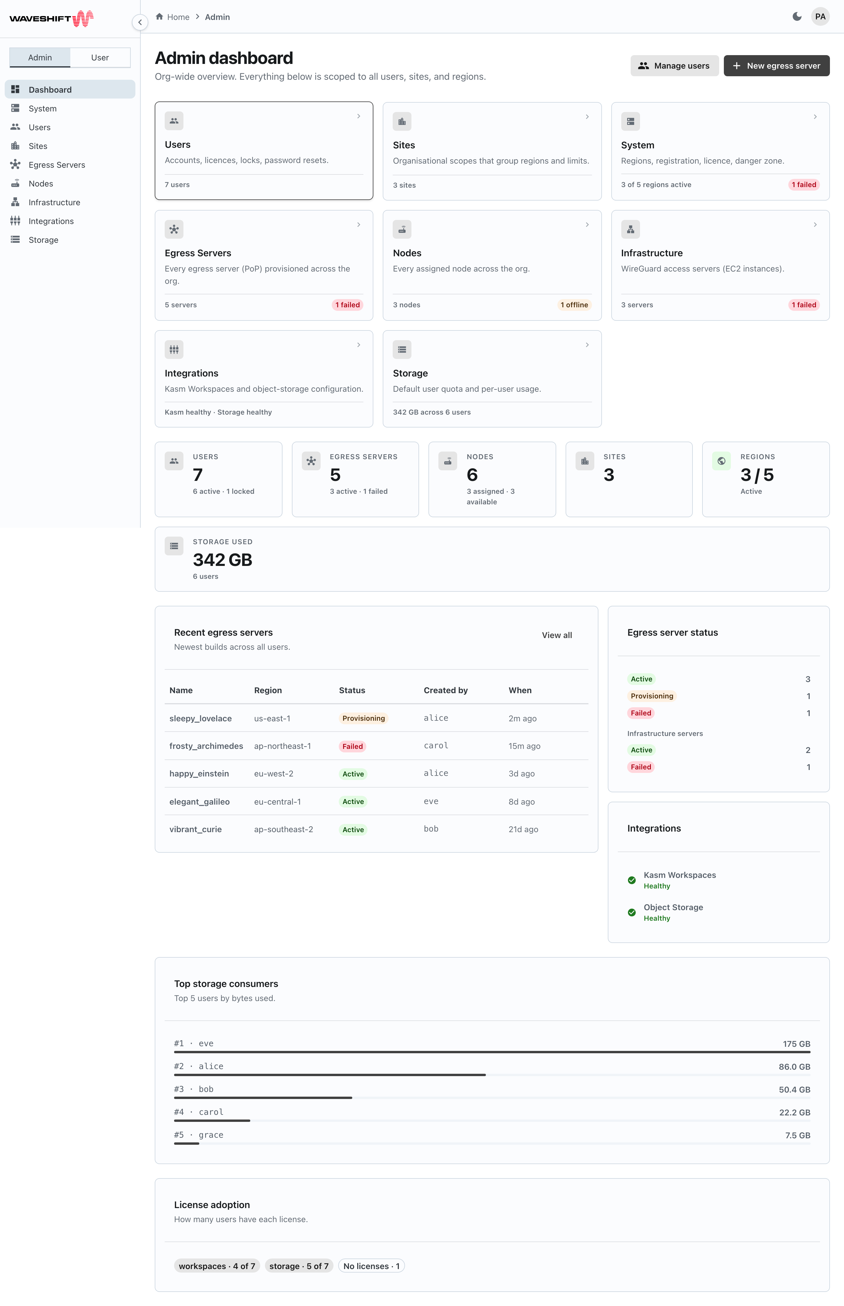
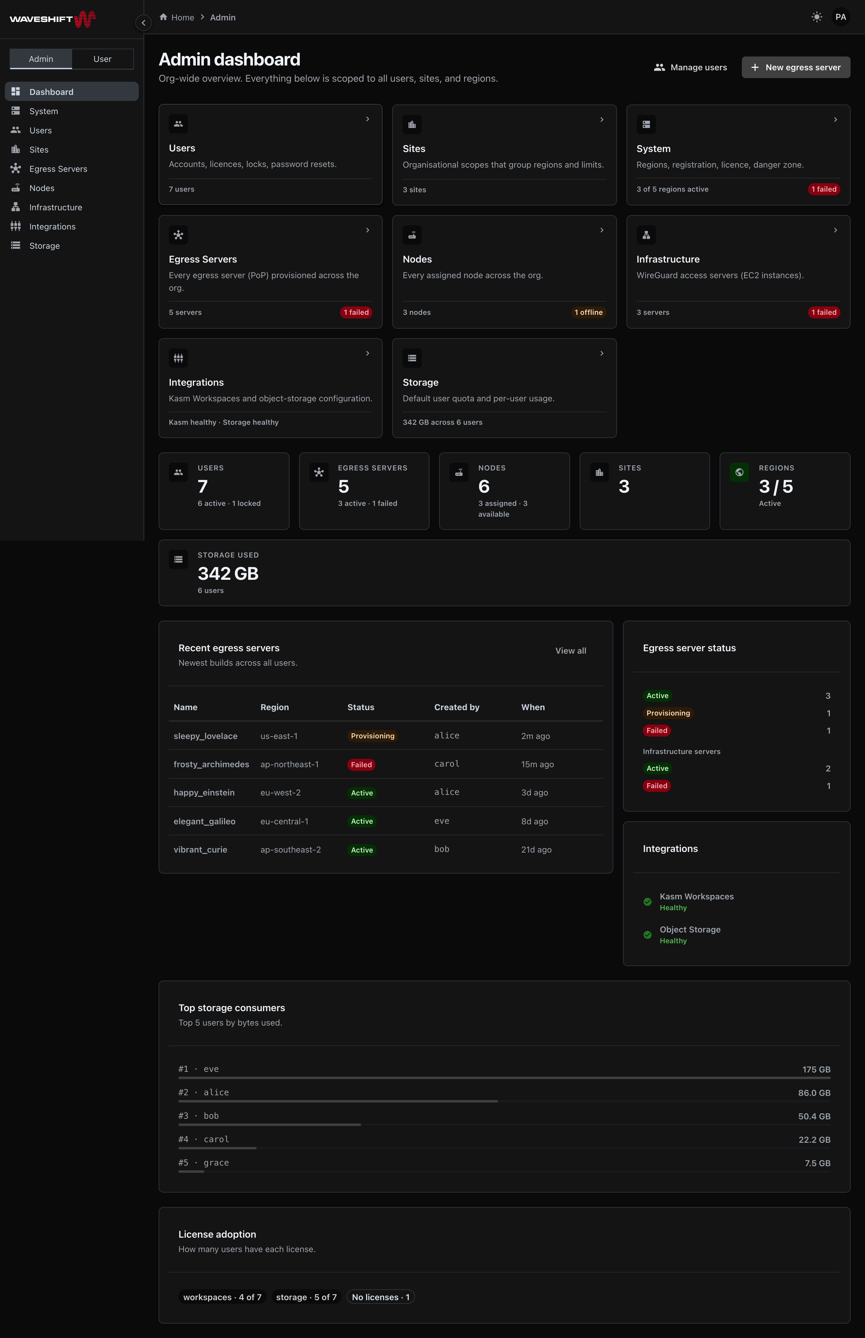
Administrators land on the admin dashboard after signing in; everyone else lands on Egress Servers.
Sign-in and identity
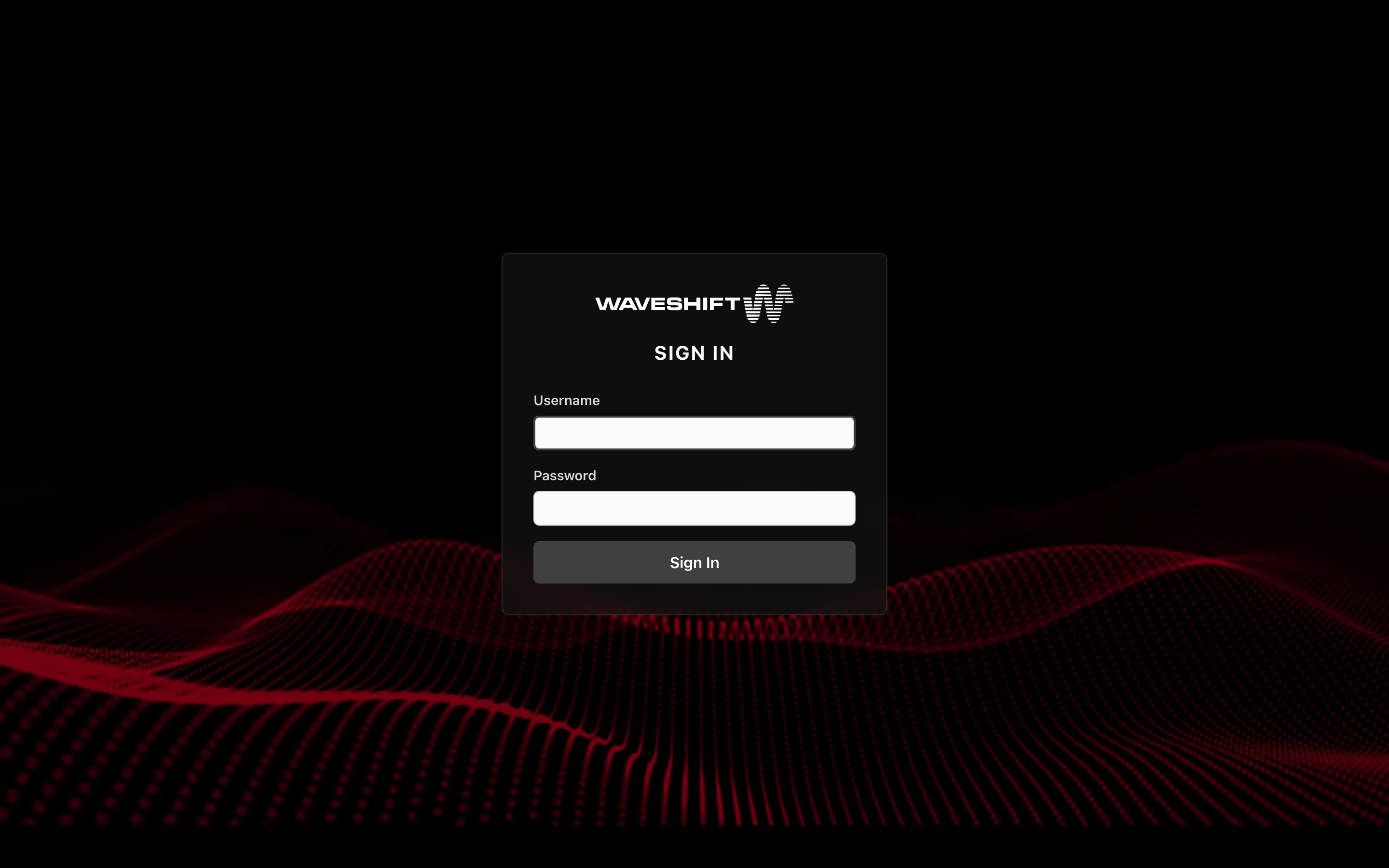
You sign in with the username and password your administrator configured. Sessions are tracked via HTTP-only cookies; the API key is never exposed to the browser. See Signing in for the login flow.
Two views: Admin and User
Admin accounts see an additional Admin mode in the sidebar — a
toggle at the top of the navigation lets you switch between User
mode (Egress Servers, Nodes, Workspaces, Files, Profile) and Admin
mode (org-wide dashboard plus the eight administration sections).
Workspaces and Files only appear if your account holds the
workspaces and storage licences respectively.
The mode is derived from the URL: anything under /admin/* is
admin mode, everything else is user mode. A regular user never sees
the toggle, and any attempt to visit /admin/* redirects them to
the Egress Servers page.
Layout
Every page shares the same shell:
- Sidebar (left) — primary navigation. Collapses to a 68 px icon rail on desktop (click the round chevron button on the sidebar's right edge) and to a slide-in drawer on mobile (hamburger button). Sidebar state persists across reloads.
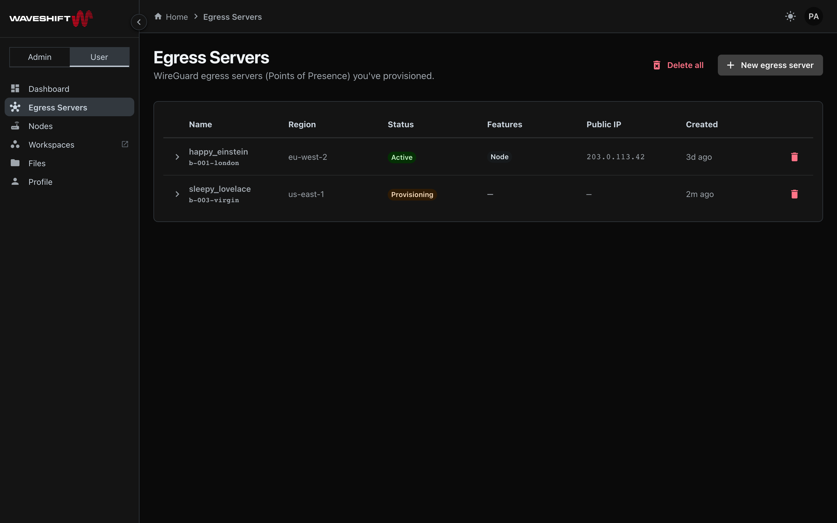
- Header (top) — the breadcrumb trail for the current page sits here, along with a dark/light theme toggle and the user menu (your avatar, top right) for Profile, About, and Sign out.
- Main content — the active page.
Theming
Light and dark modes are both first-class. The toggle in the header remembers your choice across reloads. Colour treatment matches the rest of the Waveshift product — charcoal chrome with the brand red reserved for destructive actions and brand accents.
Mobile
Every page is responsive. The sidebar collapses below the md
breakpoint (~900 px) into a slide-in drawer reachable via the
hamburger icon in the header. Tables scroll horizontally where
appropriate, and dialogs adapt to the available width.